
Randall Bolten Research Note: Worldwide COVID-19 Testing Update thru 5/10/20

Randall Bolten
Randall Bolten – longtime Silicon Valley CFO, UC Berkeley Professor and author of the book Painting with Numbers: Presenting Financials and Other Numbers So People Will Understand You – released a research note on updated COVID-19 testing numbers. Broken down by country through May 10, 2020, the United States is not near the top of the pack.
Graph shows Total Cases per 1MM pop’n along horizontal axis, Total Tests along vertical axis. Data source is Worldometers coronavirus data site. Countries graphed include all countries with 10,000 or more Total Cases, plus some additional countries – principally most of the rest of Europe, plus Australia and New Zealand.
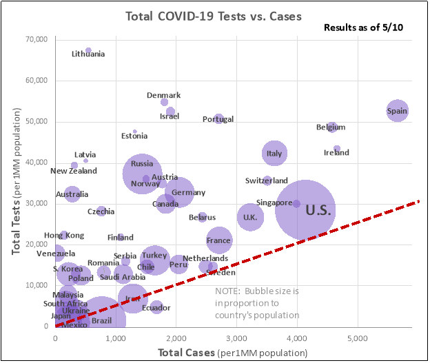
How to read this graph:
- More cases puts country farther to the right.
- More test puts country farther up.
- Lower right is bad, upper left is good!
- The size of each bubble is in proportion to the country’s population.
- Some minimum amount of testing is driven just by caseload. That minimum testing would include the original test to confirm the diagnosis, test(s) to confirm recovery – in the U.S., two consecutive negative results are required – and relatives and close associates that are obvious candidates for testing.
- If you assume that that minimum amount of testing is 6 tests per case, that amount is shown by the red broken line sloping up from the origin. If you are right on that line, you’re doing the absolute minimum amount of testing. The farther up ABOVE the red line you are, the more “strategic” testing you’re doing.
Main takeaways:
- Countries right along the red line are not doing much more than the minimum amount of testing.
- The U.S. is right in the middle of the pack – about half the countries graphed had more tests per capita, and half had fewer.
- About 33% of the world’s COVID-19 cases have been reported in the U.S., but the U.S. has only performed about 20% of the world’s tests.
- Of the countries right along the red line, none had more Total Cases than the U.S. No country with as many cases did less testing per capita than the U.S.
- The Baltic countries – Lithuania, Estonia, and Latvia – deserve special mention: few cases, a low death rate for those cases, and lots of testing. Same for Iceland, which with 158,000 tests per MM is off the chart.
Countries not shown:
- Some countries are off the chart because their testing exceeded the 70,000 tests/MM at the top of the axis scale: Iceland (158,000/MM), UAE (121,000/MM), Luxembourg (88,000/MM), and San Marino (87,000/MM, but population of only 30,000).
- Seven countries with > 10,000 cases – Colombia, Dominican Republic, India, Pakistan, Philippines, Indonesia, and Bangladesh – are not shown because they have very low incidence of COVID-19 per capita, have done very few tests, and their populations are so large that there would be a giant hard-to-understand blob at the lower left of the graph. Anyway, the real point of this graph is to highlight the testing performance of the countries in the group of nations that are more affluent and have access to more extensive healthcare systems.
